
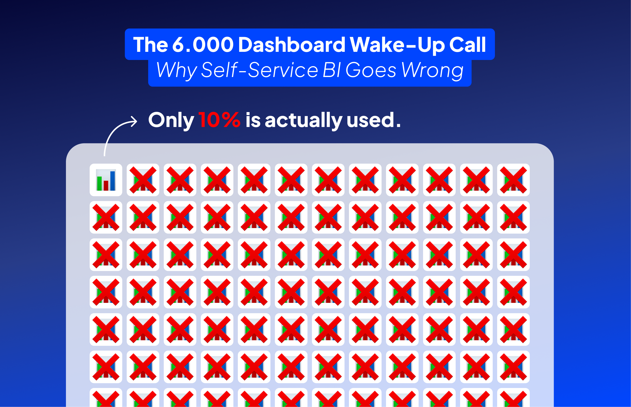
“They asked me to upgrade their AWS server because it was running slowly,” Bart recalls. “But I don’t just throw money at problems. First, I investigated what was actually running.” What he found should terrify any CFO: 6,000 apps in their QlikView environment, with 90% completely unused. They were about to spend thousands on infrastructure to support dashboards that nobody opened.
This isn’t an isolated incident. It’s the predictable outcome of self-service BI without governance. The promise sounds compelling: empower business users to create their own reports, reduce IT bottlenecks, enable data-driven decisions at every level. The reality? “Test version, version 2, version 4, version 5, version 6, nothing gets cleaned up,” Bart observes. “People build reports, test versions, copies of copies with modifications, and nobody maintains oversight.”
The proliferation happens gradually. Marketing creates a sales dashboard because they don’t trust the numbers from Sales. Sales builds their own because Finance’s version doesn’t include the metrics they need. Soon, you have five departments calculating revenue differently, each convinced their version is correct. When the board asks for quarterly revenue, which number do you present?
The cost isn’t just infrastructure. It’s credibility. When different dashboards show different numbers for the same metric, trust erodes. Meetings devolve into arguments about whose numbers are right. Decision-making slows to a crawl as everyone defends their version of the truth. The very tool meant to enable data-driven decisions instead creates data-driven paralysis.
“The problem with self-service BI,” Bart explains, “is that if you don’t know what data you’re looking at, or if there’s no governance story around what we can and cannot do, you get wild growth of reports and numbers. Eventually, you don’t know what the correct version is anymore.” The solution isn’t to abandon self-service BI, but to implement it with the structure and governance it desperately needs.
“People are forced to build reports while they don’t even know what data they’re looking at or how it’s structured,” Bart identifies the core problem. “That’s actually the biggest pitfall of self-service BI.” Imagine handing someone PowerBI and saying “build your sales report” without explaining that “revenue” in the database excludes returns, or that customer counts include test accounts. The resulting dashboard might look professional, but the numbers are meaningless.
This knowledge gap manifests in predictable ways. Users apply wrong calculations because they don’t understand data types. They join tables incorrectly, creating duplicate or missing records. They filter on the wrong fields, excluding critical data without realizing it. Most dangerously, they present these flawed insights with confidence, making business decisions based on fundamental misunderstandings of the data.
The tools themselves compound the problem. Modern BI platforms are powerful enough to let users create complex calculations without understanding the implications. “Yes, PowerBI can do complex DAX calculations. Yes, Tableau can handle sophisticated computed fields,” Bart notes. “But just because you can doesn’t mean you should.” When a marketing analyst creates a customer lifetime value calculation without knowing that the customer table includes duplicates, the entire analysis becomes fiction.
Training isn’t the complete solution. You can teach someone how to drag and drop fields, create calculated measures, and format charts. But without deep understanding of your specific data model, its quirks, its limitations, and its business context, they’re just creating prettier versions of wrong answers. It’s like teaching someone to use a chainsaw without explaining which trees to cut.
The answer isn’t to restrict self-service BI to data experts only. That defeats the purpose. Instead, create what Bart calls “governed freedom”: provide users with pre-validated datasets, clear documentation about what each field means, and templates that encode correct calculations. When users understand not just how to build dashboards but what they’re actually measuring, self-service BI transforms from a liability into an asset.
When Bart developed governance for the Flemish government, he didn’t create a bureaucratic nightmare. “We wrote governance around what must be in every dashboard and how it should visually appear,” he explains. “It was a sort of template that ensured everything was built the same way, but teams retained creative freedom while following core principles that mattered for usability.”
The framework started with clear user roles. Viewers could only look at data. Explorers could interact with dashboards using filters and drill-downs. Builders could create new dashboards, but only within their designated team space. Each team had one person responsible for their dashboards, with their own mini-environment completely separated from others. This prevented the cross-contamination of test versions and experiments that plague ungoverned environments.
Release managers served as quality gates, not bottlenecks. “They determined which of the thirty dashboards would go into production,” Bart notes. These weren’t technical reviews checking every calculation, but governance checks: Is there documentation? Does it follow naming standards? Has it been tested? The goal was consistency and quality, not perfection or control.
Documentation requirements were non-negotiable but practical. Every dashboard needed functional documentation (what’s in it, what questions it answers) and technical documentation (data sources, calculation methods, refresh schedules). “The idea was that if someone new joins the team and needs to modify a dashboard, they can read the documentation and start immediately,” Bart explains. No archaeology required to understand what the previous developer was thinking.
The key to adoption was keeping it simple. “Your governance guide should fit on one page,” Bart insists. “If it’s longer, it won’t be read. If it’s not read, it won’t be followed. And if it’s not followed, you’re back to dashboard chaos.” This one-page guide covered color usage (red for alerts only), chart standards (line charts for time series), terminology (everyone calls it “Revenue,” not “Sales Income”), and layout principles (filters always in the same position).
“The beauty of this approach is enforcement through enablement, not policing,” Bart explains. Instead of reviewing every dashboard for compliance, his team provided starter templates that already followed the guidelines. When someone needed to build a new dashboard, they began with a pre-styled template where the hard decisions were already made.
These templates aren’t just empty shells with pretty colors. They include pre-built connections to approved data sources, standard calculations for common metrics, and example visualizations for typical use cases. When every revenue dashboard starts from the same template, everyone calculates revenue the same way. The wild west problem of five different revenue definitions disappears not through enforcement, but through making the right way the easiest way.
Consider what happens without templates. A new analyst needs to create a customer churn dashboard. They spend hours figuring out which tables to use, how to calculate churn correctly, which filters to apply. They make mistakes, create their own interpretations, and add to the confusion. With a churn analysis template, they start with validated data sources, proven calculations, and appropriate visualizations. They can focus on their specific business questions rather than reinventing the wheel.
Templates also encode institutional knowledge that would otherwise live only in senior analysts’ heads. That complex customer segmentation logic that took months to perfect? It’s built into the customer analysis template. The regulatory compliance calculations that must be exactly right? They’re locked into the compliance reporting template. New users inherit years of refined expertise without knowing it exists.
“Self-service BI tools like PowerBI and Tableau are already self-service if you know what you’re doing,” Bart observes. “The tools are powerful enough. The problem is knowledge and consistency.” Templates bridge this gap. They provide guard rails that prevent users from driving off cliffs while still allowing them to choose their destination. Users maintain autonomy and creativity within a framework that ensures quality and consistency.

“Release managers determined which dashboards went into production,” Bart explains about the Flemish government implementation. “Not everything created needed to go live. These managers ensured quality without becoming bureaucratic roadblocks.” This role represents the balance between wild west chaos and authoritarian control that makes self-service BI actually work.
The release manager isn’t a technical gatekeeper scrutinizing every calculation. They’re a quality assurance checkpoint asking simple questions: Does this dashboard have documentation? Has it been tested? Does it follow our naming conventions? Are the data sources approved? The review takes minutes, not days. It’s about consistency and completeness, not perfection.
Think of release managers as editors, not censors. They don’t tell you what story to tell with your data; they ensure your story is clear, consistent, and credible. When they spot a dashboard using non-standard terminology or missing documentation, they send it back with specific feedback. This isn’t rejection; it’s quality improvement that benefits everyone.
The role also prevents duplicate efforts. When someone submits a customer segmentation dashboard for production, the release manager knows if three similar dashboards already exist. Instead of adding to the confusion, they can guide the creator to enhance an existing dashboard or clearly differentiate their new approach. This institutional memory prevents the proliferation that killed the 6,000-dashboard environment.
Most importantly, release managers protect production environments from experiment contamination. “No dashboard goes online without us knowing there’s technical documentation, functional documentation, and testing evidence,” Bart insists. This doesn’t mean months of review cycles. It means a checklist verification that takes 15 minutes but prevents hours of confusion later. When users know that production dashboards meet quality standards, they trust what they see. This trust is the foundation of data-driven decision making.
“I told them to do a cold cut,” Bart recalls about the 6,000-dashboard disaster. “90 days not used? Delete it. If they complain, they’ll come and complain, but in 9 out of 10 cases, they won’t complain because they forgot they even had that app.” This brutal but effective approach prevents the accumulation that makes self-service BI environments unmanageable.
The 90-day rule works because it’s objective and automated. No politics, no special pleading, no “but we might need it someday” arguments. Usage tracking runs continuously in the background. Dashboards that haven’t been opened in 90 days get flagged for deletion. Users receive a warning email at 75 days: “This dashboard will be deleted in 15 days unless accessed.” If they care, they’ll log in. If they don’t, it wasn’t important.
Implementation requires courage but delivers immediate benefits. That client with 6,000 dashboards? After implementing the 90-day rule, they eliminated 5,400 unused reports. Server performance improved dramatically. Costs dropped by half when they could downgrade their infrastructure. More importantly, the remaining 600 dashboards were actually valuable, making it easier to maintain quality and consistency.
The psychological impact is equally important. When users know unused dashboards disappear automatically, they think twice before creating “test_v2_final_FINAL_actually_final” versions. They clean up after themselves because the system will do it anyway. The environment stays clean not through constant policing but through automated maintenance that everyone understands and accepts.
Exceptions should be rare and justified. Year-end reports that are genuinely used annually can be tagged for preservation. Regulatory dashboards required for compliance can be exempted. But these exceptions require documentation and approval. The default is deletion, not preservation. This reversal of assumptions, from “keep everything just in case” to “delete unless actively used,” transforms self-service BI from a hoarder’s paradise into a productive workspace where every dashboard serves a purpose.

Self-service BI’s promise of democratized analytics is achievable, but not through the ungoverned free-for-all that vendors promote. As Bart’s experience proves, successful self-service requires more structure, not less. When you implement clear governance, provide templates that encode best practices, and automatically clean up unused content, you create an environment where users can innovate without creating chaos.
The path forward isn’t complicated. Start by auditing your current environment. How many unused dashboards are you paying to host? How many different versions of the same metrics exist? Document the waste, implement the 90-day rule, and watch your self-service BI transform from a liability into the strategic asset it was meant to be.
Your Next Step: Run a usage report on your BI environment today. Count how many dashboards haven’t been accessed in 90 days. Calculate the infrastructure cost of supporting these digital ghosts. Then schedule a meeting to implement your first governance rule: automatic deletion after 90 days of non-use. Your users (and your CFO) will thank you.